Tuesday, December 7, 2010

Blog #31: One last blog before midnight

So it's the last night to enter blogs. I figured I'd come in here and finish just one more before the deadline. Today as I was setting up our display case before class, I began to really realize just how much I've enjoyed this class. Art classes have usually been a bore but this has been the first time I've ever been truly challenged. I've learned so many new ideas or concepts really about art. I definately have a much less-narrow, less snooty opinion about what constitutes as art and for that I'm very grateful.

This class has been so incredibly fun, forcing me to think outside the box more than ever before. I've asked people for their hair, made a condom out of clue and performed all but naked in front of the class (which is a wild crazy college moment I'll share with my kids years from now, I'm sure). Also, I've enjoyed the teacher. I really have. At first I had my misgivings, but I've greatly appreciated her advice, input, criticism, taste, humor, and I'm not just saying that. I've enjoyed most of my teachers this sememster and it bums me a little having to move on. I believe I have someone named Migel for my next art class. Neva hoyd of him. I wonder if he was that tall teacher who helped judge the Soap and SPAM midterms? hmm *Nope, it's someone else*


Anyhoo as soon as I'm done with this project all I'll have to look forward to are 3 more finals: Theatre 101, Art History 102, and Anthropology 101. Ah me. But as far as this project is going, I think we're on top of things. It's more of an atmospheric display as opposed to a formal or forensic one. We's gunna have driftwood, sand and shells. If I could find a stuffed seagull I'd stick it in there too. Alas, no such luck. The case is smaller than I expected so we've limited our number of exhibit pieces. As for my group members, I have absolutely no complaints. They've really done their work and stuck around till I insisted they go home. Their enthusiam has been wonderful.

This whole class experience has been wonderful and I'm sad to see it end. :(


Monday, December 6, 2010

Blog #30: Last required blog...can't think of anything.

Ah...so it's the final required blog and I'm at a loss for words. Ok that's a lie. I'm always full of useless things to say. But it rained today much to my shagrin so the sand I got today was very damp and is going to be a pain to dry.

Today in generally is a hectic day. I have a speech to give in Comm101 about extinction and I have an audition today for BSU's production of Cinderella. Could be interesting. I haven't auditioned for anything in over 8 months. That's actually a very long time for a professional actor. But I no longer am one so HA! But I'm trying not to worry about that and focus on delegating time towards studying for my remaining finals and working on my project. I wrote a suicide note which got me a bit depressed. Also wrote a captain's log the day he was mutinied.

Oh! not MY suicide note! I'm not suicidal. It's for my project. The note is written on the back of a scenic landscape post card. The story is of a sick person who is dying in the hospital plans to kill himself. To choose a quick death instead of a drawn out painful one. He realised he'll never make it to where the postcard pictures and asks that whoever finds his note to please go there for him and love the life they're given.  

....I really can't come up with any interesting topics today. I'm terribly distracted. But despite this being my final required entry. I might try to get at least one more in. I'm sure class tomorrow with present some interesting ideas. Well Cheerio then.

Sunday, December 5, 2010

Blog #29: Display project progress report

With less than a week to assemble our displays, you might think that we'd be in a panic. Not yet. Not yet. Today I have several things on my checklist. One being taking a trip down to the river and getting at least three gallons of sand/grit and then drying it. As for my team, I was pleasantly suprised by their creative enthusiam last Thursday. Both had some excellent stories and were very decisive in their opinions as to what they felt worked and what didn't. I LOVE decisive input whether I agree with it or not.

It appears that the other groups are taking a humorous approach to their displays. So, it was decided that all our pieces would have a dignified and somber tone to it. Not to say that they're all depressing. Some of our pieces are rather heartwarming, even cute but the spirit in which their messages were sent adrift is quite serious. The display isn't so much about the message but rather the history put together from the evidence exctracted from the piece. This could be the language the message is written in, the date, the names given, immigration records, the dating of coins, etc. Not all the stories can be complete. Each piece is accompanied by a small plaque that gives any known information and transcriptions of any text that was found, as well as the story that this puts togethers.

For example (a little teaser for you): On a piece of drift wood found in Portugal 1948 is carved "Aleera & Stavros. A love that fills the ocean. 1919" From this, Greek marital records were scanned. An Aleera Athas & Stavros Cali were married on the 30th of November 1922. This date spans the Greco-Turkish war where turkish territories were fighting for independence. Stavros Cali fought in this war. This would suggest that Aleera and Stavros were together before the war, carved this piece of wood together just before Stavros went off to war (which he survived), and were married shortly after his return. They were marred for 68 years and are survived by over 4 generations including 23 great-grandchildren. Family members have verified this.

Artist 20/20: Elizabeth Berrien

Now here's an artist I could really get into! She is a rarity and a master at what she does: wire sculpture. The brilliance of this medium is that is can transcend from almost 2d, to wall art, to 3d sculpture to architecture. Elizabeth Berrien is a relatively unknown artist who is quickly on the rise with commissions for public works for this and the following year.


airport pegasus wire sculptureBerrien's work is unlike anything I've seen before. I mean I've twisted a piece of wire into shapes but never once thought of taking it as a serious artform. Her work is so intricate and ranges so much in size that it's mind boggling trying to comprehend it. And her subject matter knows no limits either. As said before, being a rarity Berrien's was the first known 'wire art' to be commissioned and publically displayed. In 1985 the Louisville International Airport in Kentucky commissioned this Pegasus which is still on display and is the airports official mascot.


Well...typically her work pretains to organic shapes but she's sculpted animals, plants, people, and fantastical creatures. The wire particularly works in her favor. Just like a vine, every twist and curl of her medium looks as though it grew into place. Also, Berrien often takes the qualities of different types of wire into account. Most of her work is made with standard untreated wire. Occassionally though, she'll use a plastic coated wire to add color, or a polished/stainless wire for its reflective qualities when spotted with light.
phoenix wire sculpture
3d reflective aluminum sculpture


famous wire artist by elizabeth berrien's cloud princess wire sculpture illustration graces the cover of ancestry magazine
2d wire illustration

famous wire artist elizabeth berrien's dancing female lady woman human wire sculptureMore or less the 3-dimensional manifestation of Al Hirschfeld's work, Berrien's pieces appear as though to be composed from one continuous line (and in some cases they are). Some people find her artwork whimsical, as though compose from wind and air. Others find the transparency eerie, likening the wire to veins. Either way, Elizabeth's incredible expertise has earned her the nickname "Godmother of Wire" as it would seem that there's nothing she can't do.

 award winning - obie best of show, 2 andy's, 2 adc gold's... bbc cables campaign, wire line illsutrations by elizabeth berrien of a russian protest

Saturday, December 4, 2010

Artist 19/20: Maya Ying Lin

Ok so keeping to my promise and still hot off my feminist/homo...sim art is an artist we covered in art history today. Not only do I think she stands as a testiment to female artists, but she also represents artist of ethnicity. Despite being only a first-generation American, she claims she grew up in a predominately white community and didn't even realize she was "Chinese" until later in life. She also had very little interest in her heritage until her 30's. Without even knowing it, Maya Ying Lin was the stereotype of the smart asian girl at Yale University.

Maya Ying Lin was only 21 when her design for the Vietnam Vetrans Memorial was selected. Being very simplistic, it was meant to represent a wound or gash. There are several elements that often go noticed by visitors. One being that the monument is made from hyperpolish black granted. Because of this, viewers see their reflection behind the names carved on the memorial. Also, the names are not in alphebetical order. When searching for a specific individual, the only clue you are given is the date in which they died. So an individual has to take the time to look at all of the panels just to find the one with the right date. And, once again, the names aren't in alphabetical order so then you have to scan over all the sames on that dated panel to find the one you're looking for. This forces us to realize the number of people lost to this war without skipping over these people's names like a meaningless, ordered combination of letters but as names.

All the designs submitted for consideration were anonymous and presented without names. After her concept was selected and it was discovered that she was of Asian descent, the memorial was met with gross opposition. One veteran said that the color [black] was "the universal color of shame, sorrow, and degradation in all races, all societies worldwide." Many people felt the black granite was not suitable because of its shart contrast to the other D.C. monuments which were traditionally white. Despite one's feelings, Lin reminds us that she is not dictating how we should feel, just that we should feel.

Blog #28: Sexism in the Art World

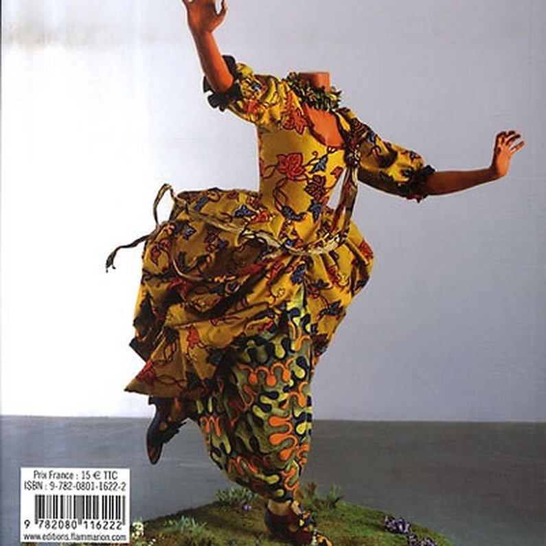
In art history today, we discussed an issue that I find very very interesting: femanine art and female artists. Apparently there is this sisterhood of artists called the Guerrilla Girls. It's a group of female artists (nobody knows exactly who) but they go around leaving posters meant to address sexism and racism in art, media, politics etc. They pointed out in their statement that in MoMa, 85% of the featured artists were male. And that out of all the nudes featured, only 2% were male.

deemed "homoerotic"
I realized that yes, there is very few popular pieces of the male nude. A female nude is considered art but I honestly can't think of a single male nude that isn't linked to homo/eroticism, relgion or both. Think about it, the most famous male nudes are probably the Davids by Donatello and Michaelangelo. Not only are they religous characters, but both artists are often written off as homosexuals. Even Rodin's Thinker was originally inteded for a sculpted dooryway depicting Dante's Divine Comedy. So it seems that in our culture, any interest in the naked male form is reserved for gay men. Because get this, I'm on a computer in the BSU library, the internet allows me to Google search "female nudes". However, when i tried searching for "male dudes" my searches was blocked, deemed innappropriate. HMMMM !!!


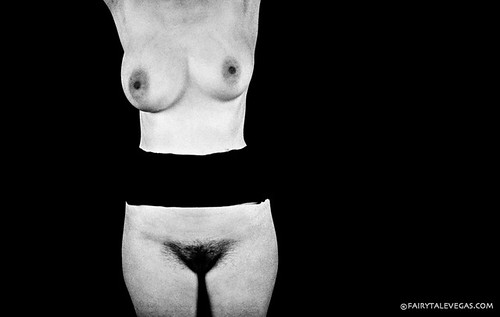
by a male artist (deemed misogynistic)
So I asked my teacher if there were any male artists who are considered feminists. She could only provide me with one name. And when I found an extensive list of "feminist artists" on wikipedia, the only male I could find was Kurt Cobain. I don't honestly don't think this is a matter of there not being any male feminist artists out there. I think there seems to be this agreed notion that you have to be female for your art to ever be taken seriously as feminist. If you haven't noticed yet, my 4 art projects for Art 108 have ALL been linked to the feminine. My first piece was meant to resemble both a cathedral door and a vagina, second piece was a purse, the third was an aborted (female) fetus made from SPAM, and my last one addressed the tension between the sexes.
 by female artist (deemed "edgy")
My classmate Maria, noticed this trend and asked if I thought it might be 'misogynistic', that i was trying to tell women how to think. I can't help but feel that, if I was a girl, that my artwork would be seen as a good thing but since I'm a guy, self-proclaimed feminists will reject it. That I can't have a hand in the message. If a woman makes a sculpture of a vagina...that's pride, but if a man paints a vagina...that's objectifying? I believe that I am the product of being raised in a VERY feminist household, I have a LOT of empathy for women, the empathy I thought they were trying to instill. But if they're not interested in my agreeance with them...well what else can I give them?

Friday, December 3, 2010

Blog #27: CJ Frei....my bizarre muse.

So today I received a compliment that's I've never liked. It usually comes from other artists who see my work and typically is something along the lines of, "You're so good. So much better than mine. I shouldn't even bother/I should just quit" It makes me feel like pooh. While I'm glad to get the compliment and to be i guess admired, if there's one thing I've learned in Art Foundations 108 its that you don't have to be the best drawer/painter to be a great artist. There are multiple ways to express your creativity and if you having a passion for art, NEVER quit.

I'm reminded of boy I used to go to highschool with named CJ Frei. I've mentioned before that I used to frown on classmates who used to "doodle" in class. Well, CJ was one of those doodlers. But in my defense the boy had among the lowest GPAs in the class but now I doubt those two had a significant amount to do with eachother. He was in my artclass and whenever we would be given three weeks to complete an assignment/project, he would get started on it right away. Doodling in class, talking about it, getting the teacher's input....I, I wouldn't even get started until maybe two days before the due date. When we got our grades back, I usually got an A. He would get something around a B. He simply didn't have the technique. I have always been able to draw. Despite never practicing and not drawing anything for MONTHS at a time...it's just a freak ability I have. I used to hold that fact above his head. That even with my minimal effort I would outdo him. (I was a shithead in that regard). But when it came around to thinking about college, he wanted to go into art but his grades were so low that he couldn't get into any art schools. I ended up getting accepted to School of the Art Institute of Chicago which was one of the top three artschools at the time. And I was offered a decent scholarship.

I turned it down. I was so arrogant and fixed in my highschool success that I was afraid of having anyone criticize my artwork. But more than that. I just didn't have the passion. I was incredibly jealous of CJ. He wanted it more than anyone to be successful as an artist. And I didn't help him pursue that dream by ever once giving him a true bit of encouragement. This guilt is a reason I've come back to school to study art. It really is something that I turned my back on and took for utter granted. No more. No more.

Artist 18/20: Don Bluth

Ok so I lied! Actually I just thought of another artist who did affect me greatly as a child and is another person i hold greatly responsible for scarring my childhood...and he just happens to be male. I don't think I've done a blog about an animator yet. You think I would have done Disney but I see that name very much like Jeff Koons. Most of the work comes from hundreds, THOUSANDS of people who work for him yet somehow it's his named that gets most of the credit. Not that I'm not an avid Disney fan but I do slightly resent that so many of artists like Mark Henn, Glen Keene, Eric Larson and the 9 old Men, Eyvind Earle, and Mary Blair all go relatively unheard of. But speaking of Disney, this particular animator once worked for the Disney Corporation as well until the late '70's when he left to start is own Studio. I speak of course of Don Bluth.

During his time with the Disney Corporation, Don Bluth had been an assistant director on Sleeping Beauty and The Sword in the Stone (two of my favorite Disney films). As an animator he worked on films like Winnie the Pooh and Robin Hood. Disney was suffering financially during the 70's and this can be seen in the animation style of the films from this era which are very sketchy, looking like painted concept sketches. This was largely because the company couldn't afford cleanup artists so instead they were literally xeroxing their sketchwork onto the clear film which then got painted. So Don Bluth left and during the next decade would make 4 of my most beloved animated films.


His first full-length film was The Secret of NIMH. This is among one of the most dark widely-known animated films that is hardly aimed at just adults. With blatant elements of death and torture it served as a cautionary tale to the scientific testing of animals and illustrated the less than fair balance of life animals must share with humans. Another film he made with the production help of Steven Spielberg is An American Tale which paralleled the hardships of turn-of-the-century jewish immigrants and the relationships between mice and cats. The subject matter is incredibly mature and even I didn't understand the cultural and historical references until I was in my late teens. Because of this, the films has garnered mixed reviews. I for one appreciated the fact that it treated it's audience like adults and gave us the benefit of the doubt that we could handle it's dark material. His third film which is my personal favorite animated film was The Land Before Time. Once again this is a film that centers around the nondiscriminatory spirit of youth and the benefits of working together. I didn't realize this was an allegorical film about racial tolerance until several years ago.

Don Bluth has long since gone down hill with realesing Disney formula knock-offs like Thumbelina and Anastasia. Then he began dumbing his stories down to appeal to a much younger audience with films like A Troll in Central Park and The Pepple and the Penguin. What happened Don Bluth. You once used to respect your viewers and was more about focusing our attention by having potent social commentaries atop an enigmatic almost abstract background. Another thing that I somewhat appreciate about Don Bluth, while at the same time disliking it, is the fact that he had an active hand in the design and animation of his films' characters. I like that because he can claims some of the credit. HOWEVER....MANY of his characters seem to have obnoxiously similar hair styles Well there you have it. Don Bluth.

Wednesday, December 1, 2010

Artist 17/20: Michelle Robison

Well I noticed just now that my favorite artists list is one big sausage fest. I apologise for this. But I wonder, why are there so few high-profile female artists in the world. Fine artists that is. So to try and make up for it, I think my final few artist entries will be about female artists ...unless I remember another artist who I REALLY like that just happens to be male. So for this entry I found a rather obscure artist who specializes in jewelry. Now I don't really wear jewelry. The only thing I have is this little hemp beaded bracelett on my left wrist and the only reason it's still there is because I can't get it off. The few pieces of jewelry (rings or necklaces) have been lost because I could remove them easily and lost them somewhere. I digress. This woman's style caught my eye because it has a bit of a spooky look to it while having some familiar elements of Art Nouveau. Such is the work of Michelle Robison.

Every single piece of jewelry she makes is a one of a kind and usually has a theme in relation to the cut gem is showcases. Upon close inspection you'll notice that her jewelry is actually tiny sculptures which hold the gems in place. This is an example of her work. It is a ring which he entitles Mermaid Fantasy. In the center is a deep blue sapphire surrounded by several mermaids as well as bits of coral and shells. I appreciate the intricacy but I loved the ring (even a bit more) when I didn't realize what those shapes were and instead I thought it was just a random organic looking mass.


Michelle Robison, as it would appear, isn't jut limited to jewelry. Another rather arbitrary piece of hers caught my eye and took me several minutes do decide how I felt about it.  Knew I liked it but why? It's called the Herald and obviously it's an angel. Most angels are white, soft, and glowing. This one is blue, dark and almost cold looking. It struck me that we generally associate Heralds (especially in the bible) with good news. But by definition there is nothing to say that a Herald can't bring bad news. Either way,if an angel looked like this it would scare the shit out of me which is strange since when you look at the shape it's actually quite beautiful. It also is one of the few sculptural pieces sprouting out of a wall frame that I actually like. Usualy I find them tacky or down right frightening but because it's so bizarrely formal looking. I lik it. Not sure if I'd hang it in my home but I like it.


Creepy!

Blog #26: Proposals Selected

So. Yesterday we gave our Final Project proposals and mine was among the selected. Yay. Go me! While this makes me a little smug, I'll be honest and say I'm a little bit bummed. By having your project selected means that you're stuck doing it and there were some other projects I think I would have had a lot more fun doing than my own.

Also, I wasn't aware that we would be split up into groups of three. I was thinking this project was going to be easy since everyone would only have to bring maybe one to two pieces to contribute. Nope. Now if we want an extensive collection we three will have to bring in four to five pieces. Really not a huge deal by anymeans. My project probably requires the least amount of craftsmanship. Rather we have to rely on creating and indicating story to get the viewers fascinated about these seemingly ordinary objects.

I recall, the advise given was to try and establish a continuity in the types of messages found. Knowing me, I think I'll stick to tragic stories. Some of the objects might seem comical in appearance (a rubber duck for example) but the message attached will be of a sincere nature. They don't all have to be sad necessarily but I think most of the messages have to be dire. They aren't meant to be trivial messages sent for a cheap laugh but to allude to a story of a person being pushed to emotional extremes. Again either they want to be found and in which case there will be a label saying whether the sender was indeed found (dead or alive) or whether the message was for sheer anonymity very much like the secret post cards which were actually one of the inspirations for this installation.

Artist 16/20: Alan Lee

Alan Lee
WHOOPS! So I went on for a week and totally forgot to do a seperate entry on Alan Lee. Here we go.

Alan Lee is a English born artist and shares the same affinity for fantasy subject matter. However, if I had to choose a preference I would have to pick Lee's jagged watercolor style over Howe's more smooth acrylic. I'm not entirely certain if both artists where in kahoots with eachother prior to their work on LOTR but they have been confirmed in their involvement with the impending prequel The Hobbit. Yay! Alan Lee has worked closely with another of my favorite British artists Brian Fraud who was the artistic director behind Jim Henson's The Dark Crystal and Labyrinth which I have mentioned in an earlier blog. But their visions have such a spooky yet magical and earthy quality that makes their work appear as though it could be easily real or at least depicting very real places and things. Another reason I like Alan Lee is that his rendition of Elven architecture is very similar to the style of Art Nouveaux where the buildings look as though they are one with the flora, as though they could have grown themselves.  


Alan Lee

Creatures of fantasy, myth, legend, and fairytales were always my favorite subjects growing up. Mermaids, dragons, fairies, unicorns, pegasus, fauns, dryads and whatnot where typically what I mostly drew from age 6 to about 16 when I found out how little appreciation there is for that type of art. Since then I've geared my work towards wildlife and portrature. Nontheless, both Lee and Howe have a very distinct sketching style that I've found is very similar to mine. Quite often we start a concept sketch and get so entrenched in the possibilities of detail that we forget the piece is only meant to be temporary and used as reference. So its sometimes very hard to part with a sketch once you've finished. This is one of the reasons shy away from sketches as I tend to go too far and grow too attached. 
life.jpg life
Mine


Tuesday, November 30, 2010

Blog #25: Tim Hawkinson vs. Yinka Shonibare

Ok so this is horrible of me to say but I might as well be honest. When we were watching the video of Yinka Shonibare I quickly noticed that his head was constantly tilted to one side. I assumed this was because he was a deep and broody artist who was tilting his head either in a condescending matter OR because he was really thinking to figure out what his art was about. So after several minutes I started to tilt my head in a mocking fashion...just then we got a full-body shot of the man aaand turns out he was disabled. Douchebag = Alaggio. That'll teach me.

As an artist, Yinka seems most known for his work with outfits resembling 18th century garb. This was the colonial period when the slave trade was at its peak. There is a level of ambiguity left to his work as well. While the construction of these costume pieces is very much Colonial the fabrics used are strikingly similar to the bright vibrant patters used in tradition West African garb. Also the outfits are placed upon mannequins which strip the wearers of any ethnic identity. Therefor it is important that Yinka's pieces never been worn by a live model as that person's race would take away from that cultural ambiguity.


With my piece, the presence of two living models was imperative. It actually didn't matter what race the models might be, just as long as there was a male and female. Yinka's work plays off the very absence of a body while simultaneously addressing the race and class issues on a multitude of levels. Both the garb and the fabric comment on the ostentatiousness of both cultures while wreaking with a certain level of irony with the period style of the clothing. Some say "you are the clothes you wear". How does that apply to this work i wonder.


 Another artist we were introduced to was Tim Hawkinson. His work also deals with the body but in a much different way than Shonibare. As stated before, Shonibare's work lacks the body and requires its implied presence. Hawkinson's work tends to resemble the body or really...body parts. In almost every piece he has done there is a certain grotesque element of bodily functions. His piece Zoopsia reminds me of organs hanging above our heads and the fact that they emit sound makes me think of gas...(could be that I'm suffering from a horrible case of bloating as I write this)... But another piece of his that I believe was made with some sort of gyrating red ink pen looks disturbingly a lot like intestines.  Hawkinson's work fascinates some because of how complex and organic his work appears while often being made from simple inorganic materials.

A few of his pieces can also be considered transformation pieces but also fall into this category of body art. For example one of his pieces was a feather and an egg made from his own hair. So in a way his work forces the viewer to ponder our mortality, our repulsion by our own bodies when distorted or dissected. The familiar and yet unfamiliar. This is one of the things that both artist share: the tendency to make us reflect on our bodies, what defines them, and how our bodies define us.

Artist 15/20: Tom Clark

"I try and present each statue with a dignity that comes from a life worth living". This is a quote from an artist who whether I like it or not has greatly influenced my home. Why some people collect little animal figurines, or beanie babies, this man's sculpted figurines are what litter my house. They were the collecting addiction my mother suffered from. Though I can't say I don't appreciate them. I attribute my very down-to-earth view of magic and fantasy to her vast collection of gnomes. Every single one of them indeed has an expression of utter contentment with their tiny and simple lives. These aren't your average, tosh, Travelocity, garden gnome but a very specific style created by a single man. Tom Clark.

Tom Clark isn't just limited to gnomes. He's done over 1000 figurines including figures from history, myth and literature. However, because it is the work that has most influenced me, I'm only going to focus on the gnomes. Much of his work ties seamlessly into the book, The Secret Book of Gnomes, by author Wil Huygen and illustrator Rien Poortvliet. This book also inspired the short-lived television series the World of David the Gnome...whom I'm sure in turn inspired the Travelocity gnome. They all have the pointy hat, wool or burlap cloths, and typically have a long white beard (assuming they're male). But an odd thing to consider is that according to the mythology, these are NOT figurines but life sized sculptures of gnomes.


Now now, I know because of the general collectability of his works that they once again fall under Kitsch but what are you going to do. They made my mom happy. Her name is Naomi and her nickname is Gnome or Gnomie (though she will always be Mom to me). And even though I'm a sap for saying this; when my mom was happy I was happy. So needless to say I hold a great amount of appreciation for Tom Clark's work. If I recall correctly his sculptures are typically made from some sort of plaster made from acorn shells. Because of this they are always the same brown hue. I'm not sure I've ever heard of another artist using this material. But his gnomes are never conventionally beautiful. Not only is his work very rustic looking but I've never seen a figurine of his that I might consider "sexy". But the important thing is just the jolly expressions they all have and that really does make them beautiful in their own right.


Monday, November 29, 2010

Artist 14/20: Stan Winston

I've featured a blog about Jim Henson who, in some respects, is very similar to my next artist. His works could easily be considered artistic masterpieces as they stand but the twist with this man's work is that his artwork moves! The movement makes his work complete since his prerogative as an artist is to make his pieces deceive us into believing that they are alive and real. Such was the work of Stan Winston.


If you've seen any of the blockbusters from the past 20-30 years than you're familiar with his work. It is because of winston that we have such creatures ingrained into our culture such as the ALIEN, Terminator, Predator, Edward Scissorhand, and the Dinosaurs from Jurassic Park. He worked around puppetry, prosthetics, face makeup, machinery, and CGI to create a special effects empire and in his career has garnered 4 oscars. Winston is sort of the opposite of Jeff Koons in that he doesn't design the look of these creatures. His job is to figure out how to make them and make them work.


While his works might seem varied they all have a certain element in common which is appears to be the intention of scaring us. Most of his work was on movie monsters. They range from the alien, prehistoric, to robotic. He was particularly great in taking advantage of our fears of being hunted, our mistrust of machinery, and seeing something of our own human evils in the monstrosities he created. He and I share a number of things in common being that he originally persued being an actor but in order to make ends meet, he began working as a makeup intern for Disney. He found his little niched in the entertainment industry which is something I envy.