Friday, November 26, 2010

Artist 13/20: Josephine Wall

Okie dokie. So while I'm on a run of fantasy artists, I'd like to share with you another artist. Her art actually ventures into the Surreal as her art is very dreamlike. I'm continuously forgetting her name. I wouldn't say she's influenced me per say with my art style. However, every once in a while I'll see one of her works and recognize it instantly and I'll have to look it up as I JUST did. Her name is Josephine Wall.

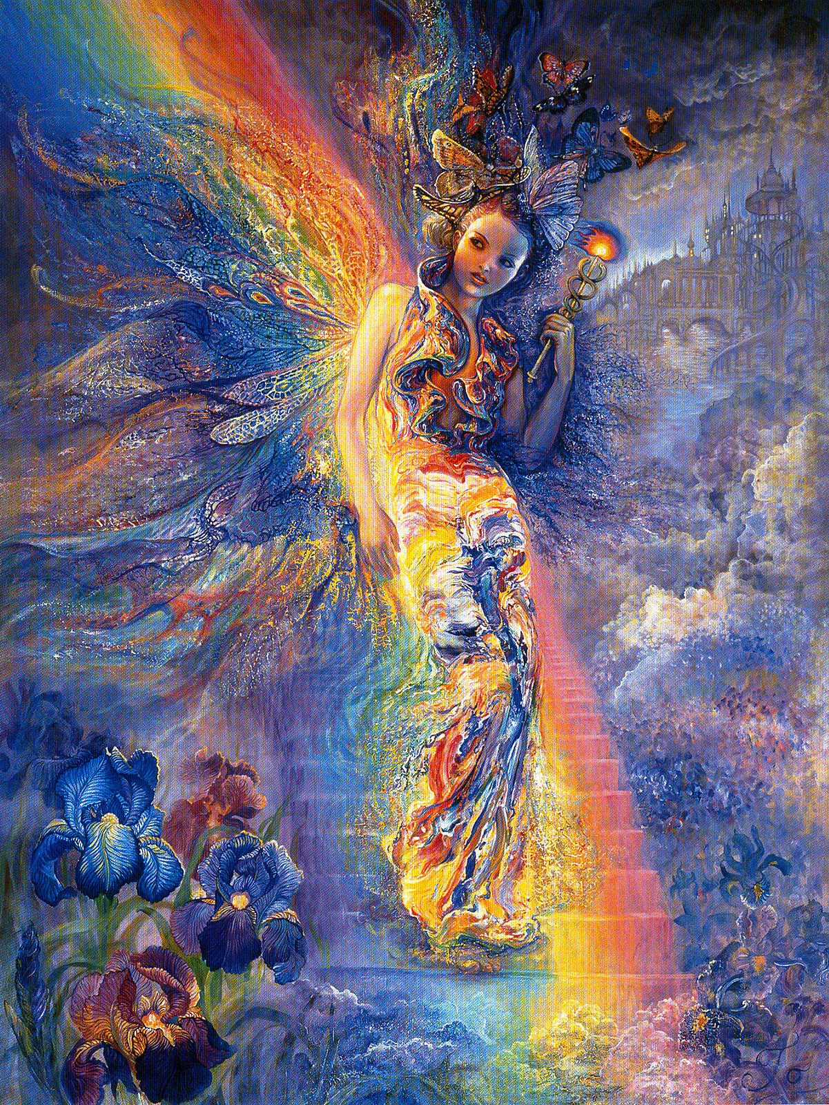
Several Christmases ago I received a puzzle as a present. I suppose Josephine isn't any better off than Kinkade in terms of being a sell out whore in that her work has been on puzzles, night lights, and whatnot. Anyhoo it was a puzzle of this painting of the Greek goddess Iris. If you don't know Iris was a sister of the harpies but for whatever reason she didn't have the body of a bird, only the wings. And so she's one of the first "angelic" figures in ancient history. This image is a collage of several of the significant attributes of Iris. She was more or less a female counterpart to the god Hermes and was a messenger of the gods to mankind. She would create the bridge of color (the rainbow) which connected the heavens with the land. She was also the retriever of souls which she would extract from the body through the colored part of the individual's eye (the Iris). Also her flower was the Iris, one of the only flowers to display every color. ....if you haven't noticed there is a color theme with this woman. I'm not sure about the butterflies....butterflies = colorfulness? I don't know. And in the background there is the city of Atlantis of which Iris secretly transported the goddess Hestia to deliver the 12 mortal sons of Poseidon. Anyhoo I love the use of color in Wall's paintings.

That is actually one of Josephine's more structured or solid paintings as most of her work consists of objects morphing or flowing into others. She is also likened to Pre-raphaelite artist by her use of embodying goddesses, elements or virtues with women (much like Herbert Draper) But her style of things melting or evaporating or sprouting out of nowhere is very reminiscent of Dali. Her work as become so iconic that it's been exhibited from America to Sweden to Japan and she has several contracts signed to sell prints of her work from very prominent museums.


Flight


The use of bold color is something I always shy away from. Take my last portraits of James Dean, Rock Hudson and Gia Carangi. After I scan my work I typically with tink around with saturation and contrast and it helps is seeing how I could always go "farther". I usually end up liking my edited work more than the originals. I've saturated the colors and like them oh so much more. This is a talent of Josephine Wall's that i hope to emulate in the future.

Thursday, November 25, 2010

Blog #21: Thanksgiving Art Time

Before I left for Thanksgiving break I decided to try and make an effort to get caught up on my blogs. So far I've succeeded only in failing to do that. BUT let it be known that I haven't been neglecting my artistic juices. As a matter o face I may have stumbled onto artistic genius. Or just something really really cool.

I am a pathetic member of the BSU BGLAD club. I say pathetic because I have yet to contribute much to the campus's gay community. However another less-than-active member (last I checked) was attempting to organize an art show at the SUB highlighting the "hardships of the LGBT community". I believe any contributing artists are supposed to pay homage to anyone who has suffered or worked to help the gay community. This can include anyone from Harvey Milk to Lady GaGa. Well, I'm fairly good at portraitures so I figured that's what I'd do since it only takes me a few hours to complete one.

After much deliberation, I decided to make attempts at a series of LGBT members who have died under tragic circumstance. This includes Rock Hudson (one of the first celebrities to die of AIDS) to a man named Robert Eads (a female to male transexual who died of ovarian cancer because no doctor would treat him). I've completed James Dean (carcrash) and Gia Carangi (AIDs) and hope to finish portraits of Matthew Shepard, Fred Martinez, Brandon Teena & Harvey Milk.

But here's where I've stumbled onto brilliance. I've decided to do these portraits in crayon. Why crayon? Because it's a humble, challenging and exceptionally neglected medium. I do not have the luxury of erasing or blending colors. And speaking of colors, because of the LGBT theme...I'm using nothing but the 6 colors of the rainbow: red, orange, yellow, green, blue, and purple. So there you have it. Most likely I'll be scanning the originals so I can enhance the colors on the computer like I do. Hopefully the art show goes as planned and I'll be exhibited. Some pieces are going to be put on silent auction. Some of the proceeds will go to the expenses of renting the gallery out and anything more will be donated to the LGBT center. So if you want one of these you'll just have to come to the gallery and fork up the doe.

Saturday, November 20, 2010

Artist 12/20: John Howe

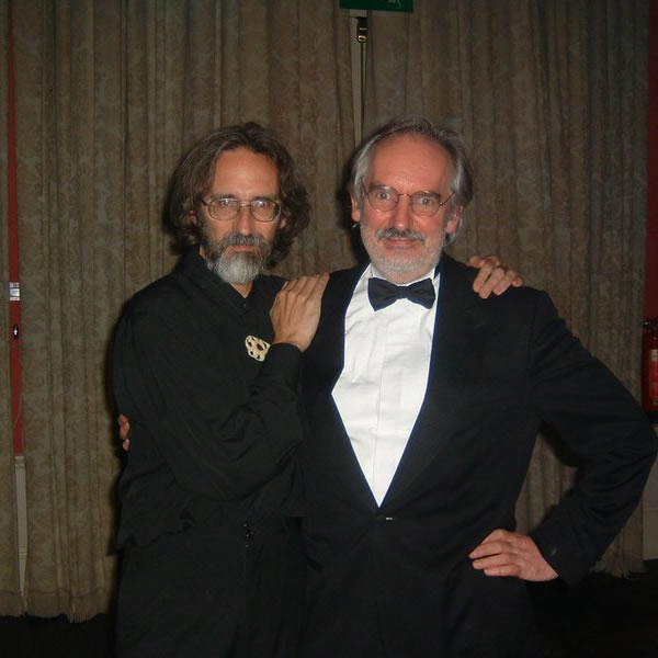
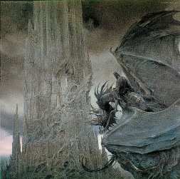
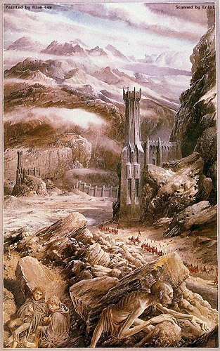
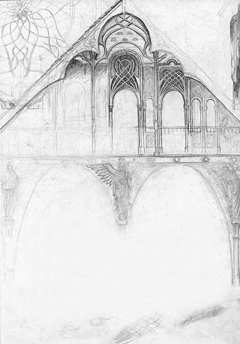
I think it would be unfair to cover one of these artists and exclude the other so I shall do my best at covering them both individualistically. Firsts I'll do one an entry about one and another later on. Together these men have created an iconic world and brought to visual life the mythology of J.R.R Tolkein. Because of them we can now artistically identify "Elven" arcitecture, "Dwarven" weaponry, and images of Minas Tirath, Mordor, the Shire that have been ingrained in our minds. Not only did they provide the illustrations to the books but also were the head artistic directors of the films Fellowship of the Ring, The Two Towers and Return of the King directed by Peter S. Jackson. The two men who accomplished this were none other than Alan Lee and John Howe.

Born in Vancouver, British Columbia John Howe was primarily self taught with the help of his mother. In school he would complete artistic assignments for fellow students for the price of 50 cents a pop. After his graduation from highschool he went on to college in Strasbourg, France, and the following year in the Ecole des Arts Decoratifs. All throughout his life has expressed a great interest for fantasy. His work focusses on the mystical and legendary which gives him the freedom of creating a yet unseen person, place or thing. His other works have included illustrations for Beowulf as well as artistic input for The Lion the Witch and the Wardrobe film from 2005. And despite that their major claim to fame is share, there is supposedly a mutual friendship between both John Howe and Alan Lee.


John Howe


Tuesday, November 16, 2010

Blog #20: Disney Princesses (part deux)

WELL! Guess what I found out the other day. My work is on the internet media. Unfortunately not some original idea that I've come up with but once again my Disney Princess Lineup. I seem to only be doing that coporation favors. So this time around it's on a website channel called Indie Mogul which appears to run reviews and raise awarement of upcoming movie releases. In this case it was a Disney Princess Top 10 countdown in lieu of Rapunzel joining the lineup.

Disney-Princess-Lineup-disney-princess-11846005-1280-800.jpg
Add caption
I was aware of the upcoming film over a year ago and had only seen minimal footage. Rapunzel was not well received by myself and fellow Disney buffs, mainly because her film was in 3d and clearly a comedy. Gone are the days when a dramatic fairy tale is taken seriously. Well in my liesure time's prime, I made several alterations to the Disney Princess lineup, as I've mentioned before. I've added Princess Tiana, I altered the color of some of the dresses, I created Ariel's & Jasmine's dresses altogether, and finally I got around to sticking Rapunzel in there. It was doubted that she would mesh well in the lineup due to the fact that she's 3d and all but I thought I'd give it a try.

Normally I would search the internet for a large enough picture of her to edit and superimpose. However no full-body images of her existed yet (at least none that would work). I knew what she looked like and so I tried just modifying various body parts of the other princesses to make a Frankenstein as it were but I simply wasn't pulling it off. So finally I came across some merchandize material that had pictures of her on it including a doll box, a few coloring books, and whatnot. So with a good image of her face, a partial image of her body, and several segments of her hair I was able to piece her together and soften her three dimensional look. She still stood out in both style and texture so I never took much pride in it. Nonetheless, apparently the image is now being used on DisneyWiki http://disney.wikia.com/wiki/Disney_Princess and latest this following film clip. An older version is also currently the header image for Wikipedia's Disney Princess article http://en.wikipedia.org/wiki/Disney_Princess . My only complaint is that people use it assuming its an image released by Disney. But nope. It's mine.

Sunday, November 14, 2010

Artist 11/20: Alphonse Mucha

Now this artist, I knew I liked for a very long time. His style is so distinct that no one can make anything similar without being referenced to him. I would intermittently come across his works but never knew his name. This is Alphonse Mucha.

He is often referred to as the accidental father of the Nouveau. Having moved to Paris he accepted a last minute commission to design a theatre poster for a local play. His innovative style was an immediate success amongst the Parisians and soon he was in the highest of popular demand. During the movement (1890-1905) Art Nouveau permeated from painting into sculpture, architecture, furniture, jewelry, calligraphy and even works of glass by the famous Louis Comfort Tiffany whom we've covered before.
marianne_enchantedstill3.jpg image by costumersguide


Mucha's style is indicative by the use of thick outlines surrounding his subjects. This could be likened to the lines used by Sandro Boticelli but Mucha's lines were so thick it almost appeared like a stained glass window with areas being highly detailed and others being nearly monochromatic. I've done a bit of research on Mucha before as it was his style that specifically inspired the Disney film Enchanted staring Amy Adams as the princess parody, Giselle.


 Upon examination, one can see that her dress is identical to that worn in a poster advertising Moet & Chandon White Star, a brand of French Champagne painted in 1899. While obviously Giselle's facial features depended heavily on those of Amy Adams, the actress herself can be compared to the type of woman Alphonse Mucha seemed so keen on painting. Being primarily restricted to the female form, his subjects were often women of literature, goddesses or the physical embodiments of art and virtues much in the same way Giselle embodies the essence of a Disney Princess.

Artist 10/20: Thomas Kinkade

I'm hitting up Kitch Central today baby! Thomas Kinkade. Oh yes. The king of cheesey marketability himself. And what can I say...yeah...I'm a sucker for pink trees and gazebos. He's known as the 'Painter of Light' and is apparently the most collected living artist.

Yes well...the man is a sellout whore. There's no denying that. His art can be seen on puzzles, candles, keychains, whatever, everywhere! And not only is his art "serene" and "heart string pulling" but the man is a sell out whore because he knows exactly what the american people want. His work almost reflects what I think is the idealic dillusion many americans have of this country. This self-riteous, pretentious, christian american attitude is slapping us in the face with every brushstroke. There's nothing real in the man's work. It's all dreamy and perfect which can rub some people the wrong way. I personally don't mind that so much as people trying to apply religous context. Then I find out that he's a born-again christian and yes, his work also reflects that with a sudden up-surge of crosses and prophetic sunbeams.

But is this shameless commercialization so wrong? What is the artist dream? I should think that all artists would dream to be taken seriously for their work within their lifetime. Perhaps its the fact that Kinkade hasn't done anything "new". The man is stinking filthy rich and I think most artist (myself included) are just bitter. We all want to change the world, not profit from taking advantage of what other people want. But even if your art was loved by the masses, wouldn't you be ok with slapping it on a t-shirt? The artist is a self-absorbed individual...I can attest to this.

Sadly, the more I read about the man, the less I like him but his garden work is just pristine and a part of me doesn't see these scenes as unattainable. My life-goal is to have a plot of land which has been landscaped with these paintings serving as ground plans. Even if it isn't a perfect representation, I like to depict people, places and things in their optimal potential.

Blog #19: Progress report!

OH Unhappy Day! I've lost my USB thumbdrive which contains all my digital work, including my disney princesses, my personal photos, papers written for other classes, and programs I used. Well actually I must have lost it nearly 3 weeks ago and I'm only now getting around to lamenting about it. It really is distressing since I rarely misplaces things. Rather, it must have fallen out of my hoodie pockent when I tied it around my waist. Bah! Anyway, I've been working around it and I supposed it really isn't work blogging about.

Well I've been working on my latest project semi-diligently. It's been a trip. First I couldn't find any tights/pantyhoes that were under 4$ and I knew that a single unitard would require at least 4 and I wasn't about to spend $36+ on this project. But then somone mentioned the dollar store and Eureka! Not only were they a buck, but they were also nylon/spandex knit so they don't run as easily. So my week was fun, forcing myself into "Queen" tights all over various parts of my body. I tell you,  "queen" must not refer to a size otherwize I'm insulted for women everywhere! Those things were in some dire need of stretching.

After I formulated a rough patter, I was wondering how the heck was I going to put this thing together? I figured I couldn't use a normal stitch for fear the tights would just shred. I turned to glue but realized that wouldn't stretch and I wasn't about to glue it together while I wore it. So I resorted to using a loop stitch and wouldn't you know, IT WORKED! Worked like a dream it did. I still haven't fitted this to my female model....could be problematic. I've got two unitards constructed and all that's left is making the connecting tubes and rehearsing the performance. The tights still come off as transluscent and while I've got underwear I'm wondering what accomodations I'll have to make for her. We'll see....we'll see